
Designinginterfaceswith chaos, emotion,& precision.
A UI/UX, product & creative designer building digital experiences that feel inevitable in the user's hand. Currently shipping from Jaipur — open to studios, startups & strange briefs worldwide.
A designer
who treats
interfaces
like cinema.
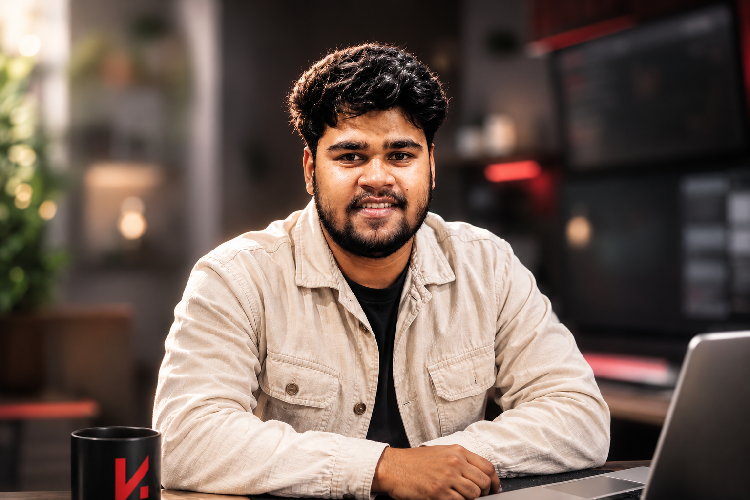
I'm Kishore — a UI/UX & Product Designer building digital products that feel inevitable. My work lives at the intersection of research, systems and story.
Currently pursuing my BCA at Manipal University Jaipur and Google UX Design Certified. I design responsive web and mobile products, build scalable design systems in Figma, and care obsessively about typographic rhythm, interaction timing, and the choreography of a single tap.
My philosophy is simple — great design is invisible in use and unforgettable in memory. I'm looking for studios and product teams where I can ship serious UX, grow alongside great engineers, and turn ambiguous briefs into experiences people actually remember.
Inside the
designer's OS.
// a live look at the operating system
// currently running my brain — windows, tabs,
// obsessions, principles, all of it.
Mandal.
that respects your time.
editorial brutalism,
and motion that means something.
- 01clarity over cleverness.
- 02motion is meaning, not decoration.
- 03whitespace is a feature.
- 04design the empty state first.
- 05if it needs a tooltip, redesign it.
always.
Work that ships.
stories that scale.
— eight selected projects.
— product, web, mobile.
— each, a study in clarity & motion.
Capsule.
Capsule.
InKart — eCommerce
A conversion-engineered storefront. Discovery rebuilt like a film reel, checkout choreographed to disappear, design system tuned to scale across SKUs.
Existing storefront buried products under noisy navigation and a 5-step checkout that lost users at payment.
Rebuild discovery and checkout into a single, calm flow that scales across 200+ SKUs.
Aanya, 26 — urban shopper buying on mobile during commute. Wants speed, trust, and zero friction.
Most test users abandoned at address entry; the PLP made it hard to tell brand from price at a glance.
Editorial PLP grid, sticky filters, a 2-step checkout with smart defaults, and a token-driven UI kit for new categories.
- Reduced checkout steps from 5 → 2
- Improved product discovery clarity
- Scalable design system across 200+ SKUs
door-fast.
FreshKart — Grocery
Fresh produce, frictionless flow. Browsing rhythm tuned to the thumb, a checkout that vanishes, a hierarchy that lets food breathe on screen.
Daily grocery apps overwhelm with categories. Users wanted a 10-minute reorder, not a hunt.
Design a thumb-first flow that gets repeat buyers to checkout in under 60 seconds.
Rohan, 32 — busy parent reordering staples 3× a week. Values speed and reliable freshness.
Repeat purchases dominated, yet 'Reorder' was buried 3 taps deep.
Reorder-first home, category chips above the fold, single-screen cart, calm green-on-near-black palette for produce clarity.
- Repeat-order flow reduced to 3 taps
- Cleaner produce hierarchy & legibility
- Reusable category & cart components
under candlelight.
Chokhi Dhani Sonipat
An editorial-grade hospitality story — cultural texture, cinematic rhythm, a booking system as warm as the lobby it stands for.
Heritage resort was being judged by a dated site — premium guests bounced before reaching booking.
Translate the on-property warmth into an editorial, cinematic web experience that converts.
Meera, 38 — planning a weekend retreat. Decides in 90 seconds whether a property feels real.
Guests valued story and ambience over feature lists; current site led with grids of amenities.
Hero storytelling, candlelit color system, calm reservation flow with clear room narratives and trust cues.
- Storytelling-led narrative replaces feature dump
- Booking flow simplified to 3 clear steps
- Cohesive brand voice across web surfaces
tenses.
English Learning Platform
A modern classroom redrawn. Student-first navigation, dashboards that motivate, accessibility woven through every micro-interaction.
Learners dropped off after lesson 3 — progress was invisible and lessons felt isolated.
Make progress feel earned and the next step always obvious.
Ishita, 19 — undergrad improving for IELTS. Studies in short bursts on a laptop between classes.
Motivation collapses when learners can't see momentum; streaks and visible mastery move retention.
Progress-led dashboard, lesson cards with unit mastery bars, contextual practice, AA-compliant color & type.
- Clear lesson → practice → test loop
- Accessibility baseline (WCAG AA contrast)
- Reusable EdTech component library
Swaasth — Doctor
Built for the white coat. Schedules, patients, records — engineered for trust, clarity, and as close to zero cognitive load as a screen can get.
Doctors juggle 20+ patients/day across paper, SMS and EMRs. Context-switching costs minutes per consult.
Give a clinician a single-glance view of their day — patient, time, action.
Dr. Mehta, 41 — GP in a busy clinic. Needs information in seconds, not screens.
Schedule and 'next patient' were always the first taps. Everything else was secondary.
Schedule-first home, large 'Next at…' card, prescription flow in 4 taps, calm clinical-blue system.
- Reduced cognitive load on the daily schedule
- Prescription flow simplified to 4 taps
- Trust-led color & typography system
Tue · 10:30 AM
Swaasth — Patient
Healthcare without the friction. Appointments, prescriptions, follow-ups — wrapped in a calm, accessible mobile architecture.
Patients abandoned booking when symptom inputs and doctor search felt clinical and intimidating.
Make booking, reminders and follow-ups feel as easy as messaging a friend.
Kavya, 29 — first-time user post a routine check-up. Anxious, mobile-first, wants reassurance.
Friendly micro-copy and a visible 'next appointment' lowered anxiety more than feature density.
Next-appointment hero, vitals tiles, prescription tracker, plain-language copy, AA color contrast.
- Appointment booking in under 60s
- Visible 'next visit' reduces anxiety
- Accessibility-first mobile architecture
that flies.
Broadband Web Platform
A conversion-first landing system with surgical hierarchy and a responsive grid that holds its line at every breakpoint.
ISP site dumped 12 plans on the homepage. Users couldn't tell which plan fit them.
Lead with one decision — speed — then surface the right plan in two clicks.
Arjun, 34 — comparing fiber providers for WFH. Wants 'best plan for my house', not a spec sheet.
Plans needed framing (Basic / Pro / Ultra) and a hero that sold speed as benefit, not number.
Single-decision hero, 3-tier plan grid, sticky CTA, fluid grid down to 360px.
- Plan choice reduced from 12 → 3 tiers
- Single-decision hero increases clarity
- Responsive grid stable to 360px
Reway — Mobile App
Futuristic mobile interface with a scalable UX architecture. Interactions that anticipate, components that scale, motion that means something.
Navigation apps overload the screen with metrics. Riders only need: where, how long, what next.
Reduce on-screen information substantially while keeping every critical signal.
Vihaan, 24 — commuter who glances at the screen between traffic. Cannot read text-heavy UI.
Glanceable hierarchy (one metric at a time) felt safer and more confident in user testing.
Map-first hero, ETA as the headline, supporting metrics as small tiles, micro-motion for state changes.
- On-screen information substantially reduced
- Glanceable ETA-first hierarchy
- Reusable motion + component system
What I build.
UI / UX Design
Human-first interfaces — researched, prototyped, polished into things people remember.
Product Design
End-to-end product thinking, from problem framing to ship-ready systems.
Web Design
Editorial, motion-forward web experiences on disciplined grids.
Mobile App Design
Native-feeling journeys with gesture-aware interaction and meaningful motion.
Design Systems
Component libraries and tokens that turn brand DNA into engineered consistency.
Branding & Identity
Visual systems with conviction — logo, type, color, tone that earn attention.
Wireframing & Prototyping
Low-to-high fidelity flows that de-risk decisions before code.
Responsive Design
Fluid layouts engineered for every breakpoint, every device.
Creative Direction
Holistic art direction tying strategy, story and surface into one voice.
How I think,
before I design.
— research → strategy → wireframe
— prototype → testing → ship
— a loop, not a line.
Research
User interviews, competitor teardown, journey mapping. The brief is where listening begins, not where decisions end.
Strategy
Translate insight into a product hypothesis with sharp intent — what to build, what to cut, what to prove first.
Wireframing
Low-fidelity speed runs — information architecture, flow trees, and structural choices before any pixel commits.
Systems
Tokens, components, rules. Type, color, spacing and motion engineered for consistency at scale.
Prototyping
High-fidelity prototypes in Figma — micro-interactions and motion treated as part of the thinking, not the polish.
Testing
Usability sessions, heuristic reviews, and iteration cycles. Decisions backed by evidence, not opinion.
Ship & Learn
Hand-off ready specs, dev pairing, and post-launch reviews. Ship, watch, refine — the loop never closes.
Identity systems with conviction.
Experiments &
moodboards.
Explorations in product concepts, storytelling systems and creative direction. Where the weird ideas live before they're tamed.
What teams say.
"Kishore reads briefs the way good directors read scripts — he finds the story inside the spec. The prototypes felt finished from review one."
"Rare to find a designer who balances aesthetic instinct with system-level rigor. Our library finally feels like infrastructure, not decoration."
"The hospitality redesign moved metrics, but more importantly — it moved people. Guests started screenshotting the site."
"Calm, opinionated, and unusually fast. Kishore unblocked our roadmap and left us with a design language we still ship against."
Let's build
something
exceptional.
A brief, a problem, or a half-formed idea — send it. I reply within 48 hours, usually faster, usually with too many questions.